A taste for the future
For 25 years, Aarstiderne has been a pioneer in shaping Denmark’s organic food culture. As the market evolved and consumer expectations expanded beyond organic, the brand faced the challenge of staying ahead while remaining true to its values. It needed a refresh—one that built on its legacy while bringing new energy to its identity and communication, ensuring it continued to inspire the next generation of conscious eaters.
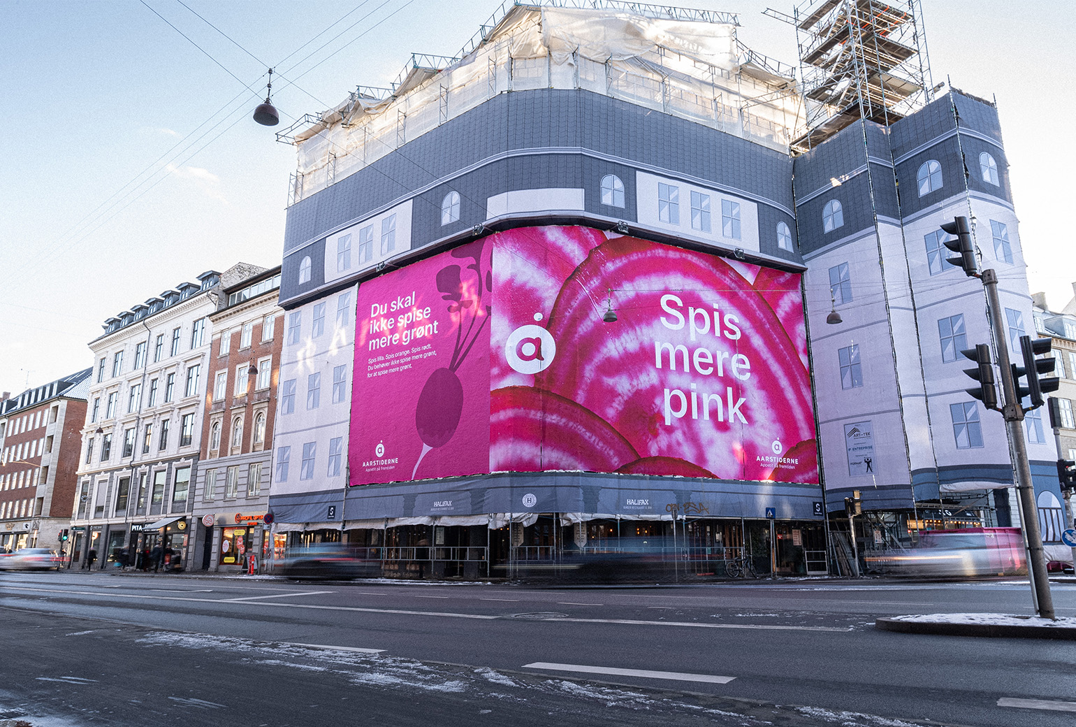
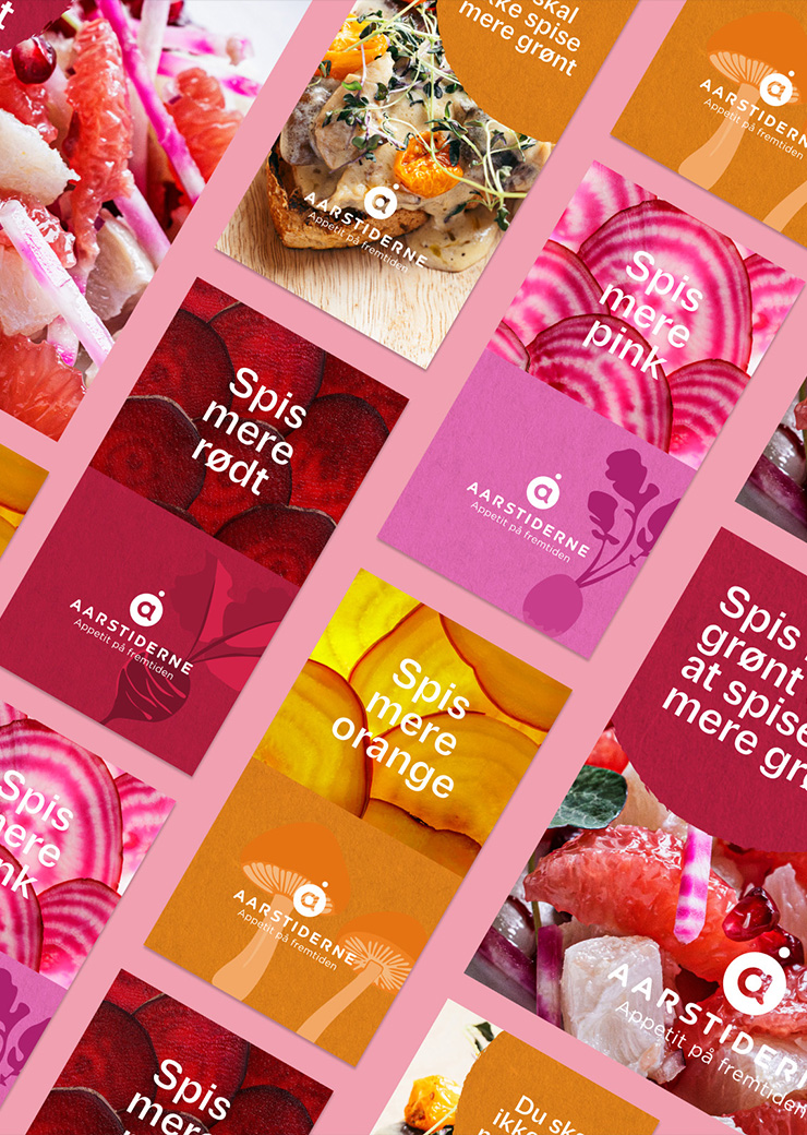
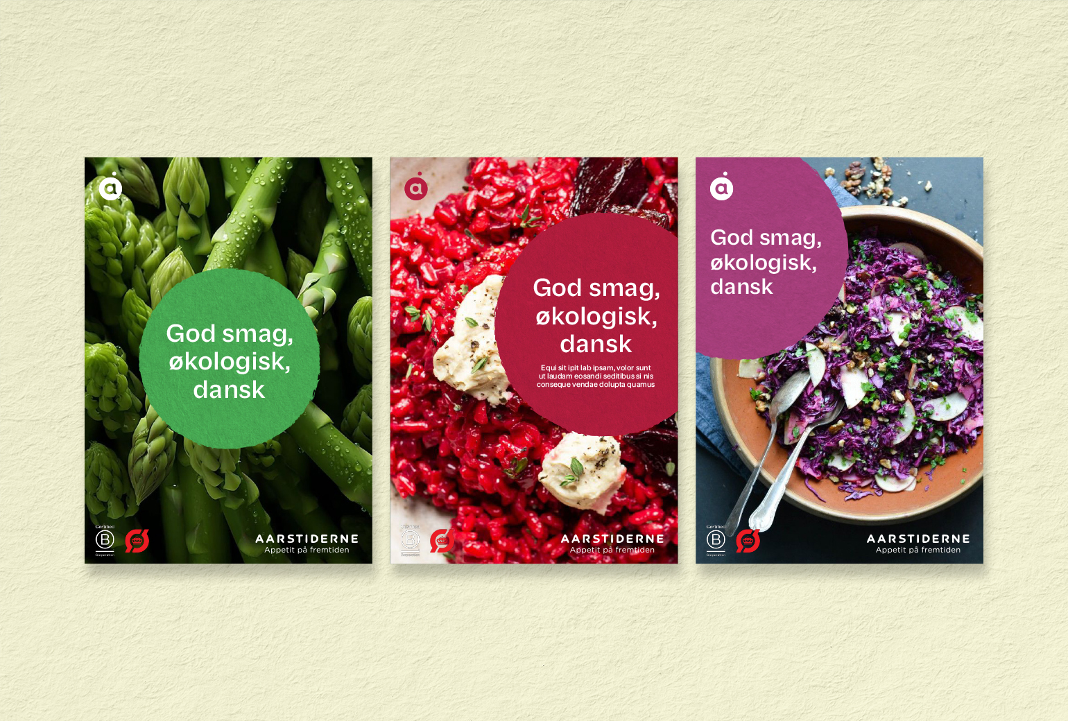
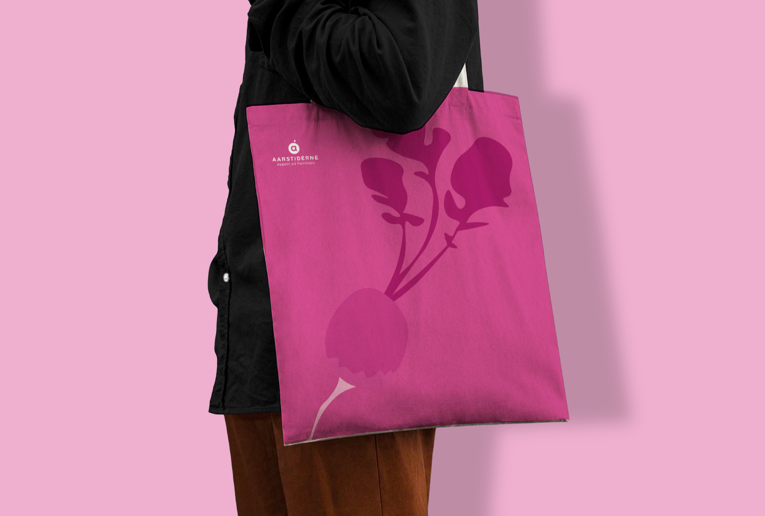
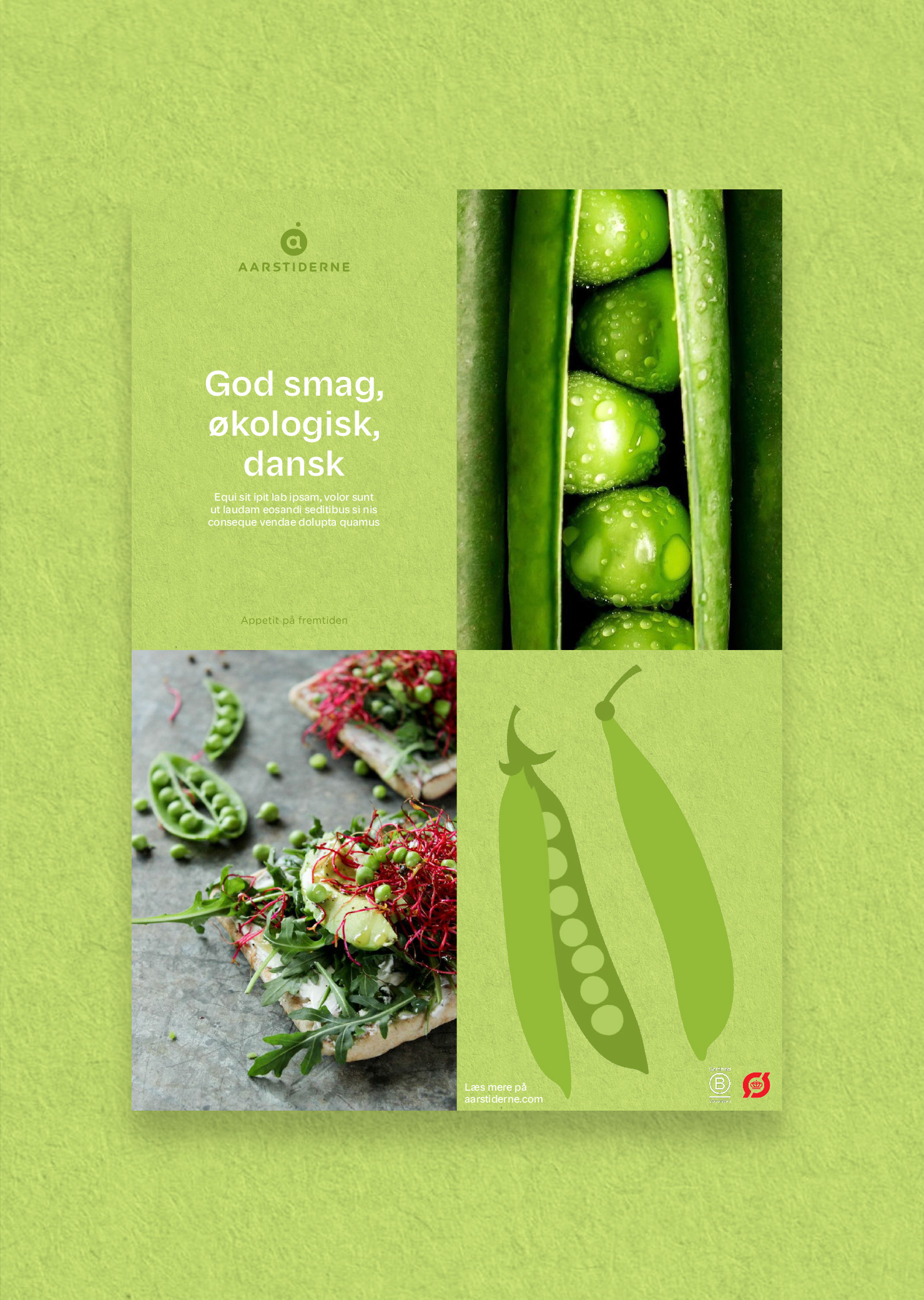
We introduced a bold new campaign and a refined brand identity that feels both timeless and forward-looking. The logo builds on Aarstiderne’s heritage while sharpening its presence. A richer colour palette and evolved visual style highlight the full depth of natural ingredients, while new design elements and imagery give the brand a contemporary edge.
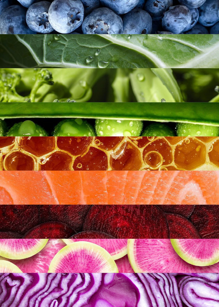
We launched a campaign that moves the conversation beyond eating “green” to eating in full colour – because eating well isn’t just about green. It’s about pink, purple, orange, and yellow too. Honouring the past while setting the table for the future, we brought it all together with the tagline “Appetit på fremtiden” (A Taste for the Future), redefining Aarstiderne’s vision for the next generation and infusing new energy into a brand deeply rooted in tradition.
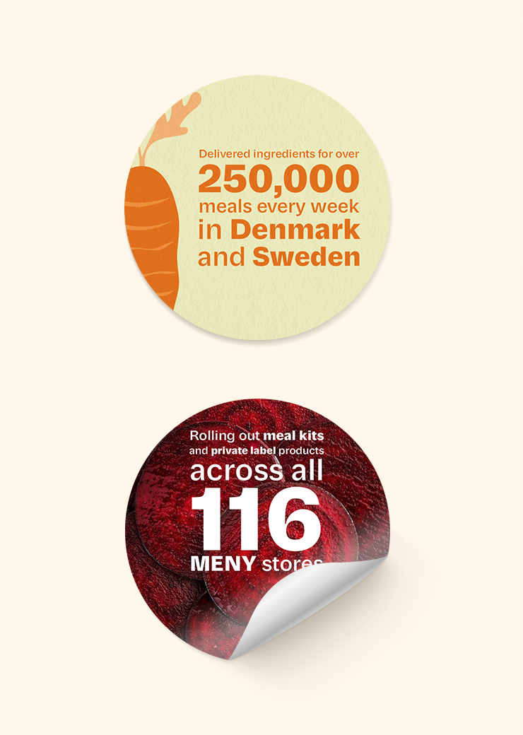
Aarstiderne continues to scale its impact. In 2024, the company was acquired by Dagrofa and delivered ingredients for over 250,000 meals every week in Denmark and Sweden. As of 2025, Aarstiderne is rolling out meal kits and private label products across all 116 MENY stores.
